Redesign Avrotros Klassiek
With the total makeover of the AVROTROS broadcast network's identity, I redesigned the design for AVROTROS Klassiek Presenteert, the loyalty program that supports upcoming classical music talent.

The new identity of AVROTROS uses the bold and custom-made typeface 'Midnight,' which is heavily present throughout the network's branding. It's also used as a graphic element, creating statement typography. I implemented every detail into the grid and layout, adding a secondary typeface suitable for print.


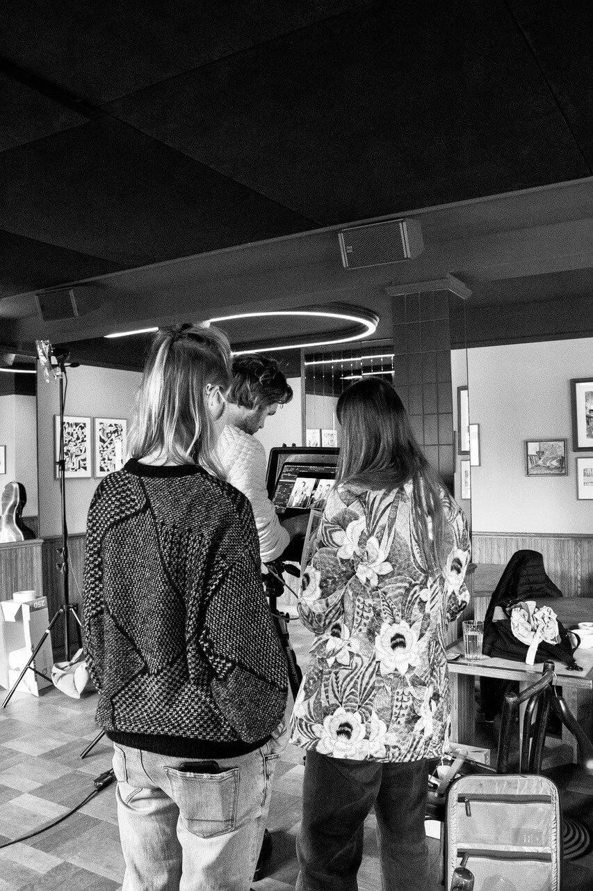
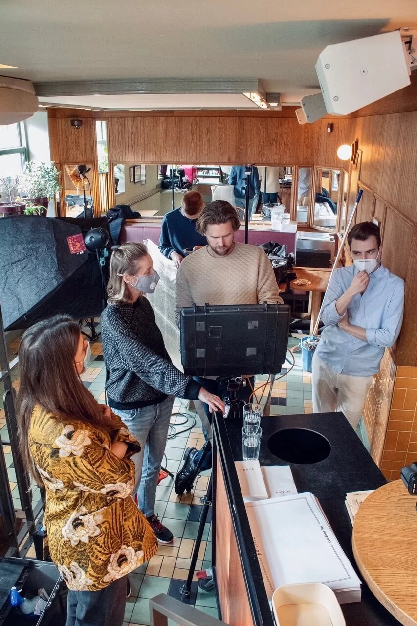
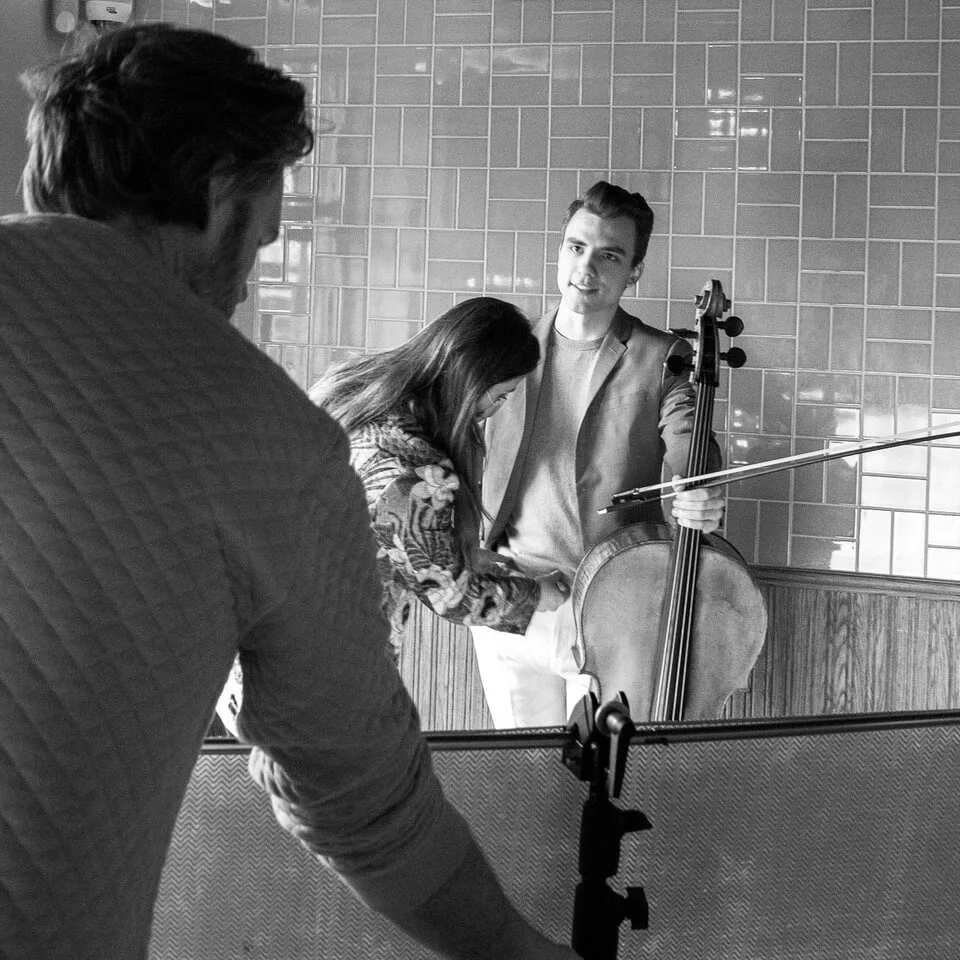
Apart from art direction and design, photography is essential to the magazine’s impression. Each edition revolves around an upcoming talent, their instrument, and relevant well-known classical composers.
By working with rewarded photographers, such as Anne Claire de Breij, Tom ten Seldam, and Martin Sweers, I invest in creating a photography concept that surprises the reader. Each photo shoot is prepared in detail, which involves putting together the creative team, deciding on the location, wardrobe choices, hair and make-up, conceptual twists, a mood board, and handling the entire production.