
Work & Show: Studio Dorien Franken
An interview by BNO about the rebranding of &C Media.
Dorien Franken talks about the rebranding of &C Media and building a flexible design system that works across print, online, social, and podcasts, without losing brand recognizability.
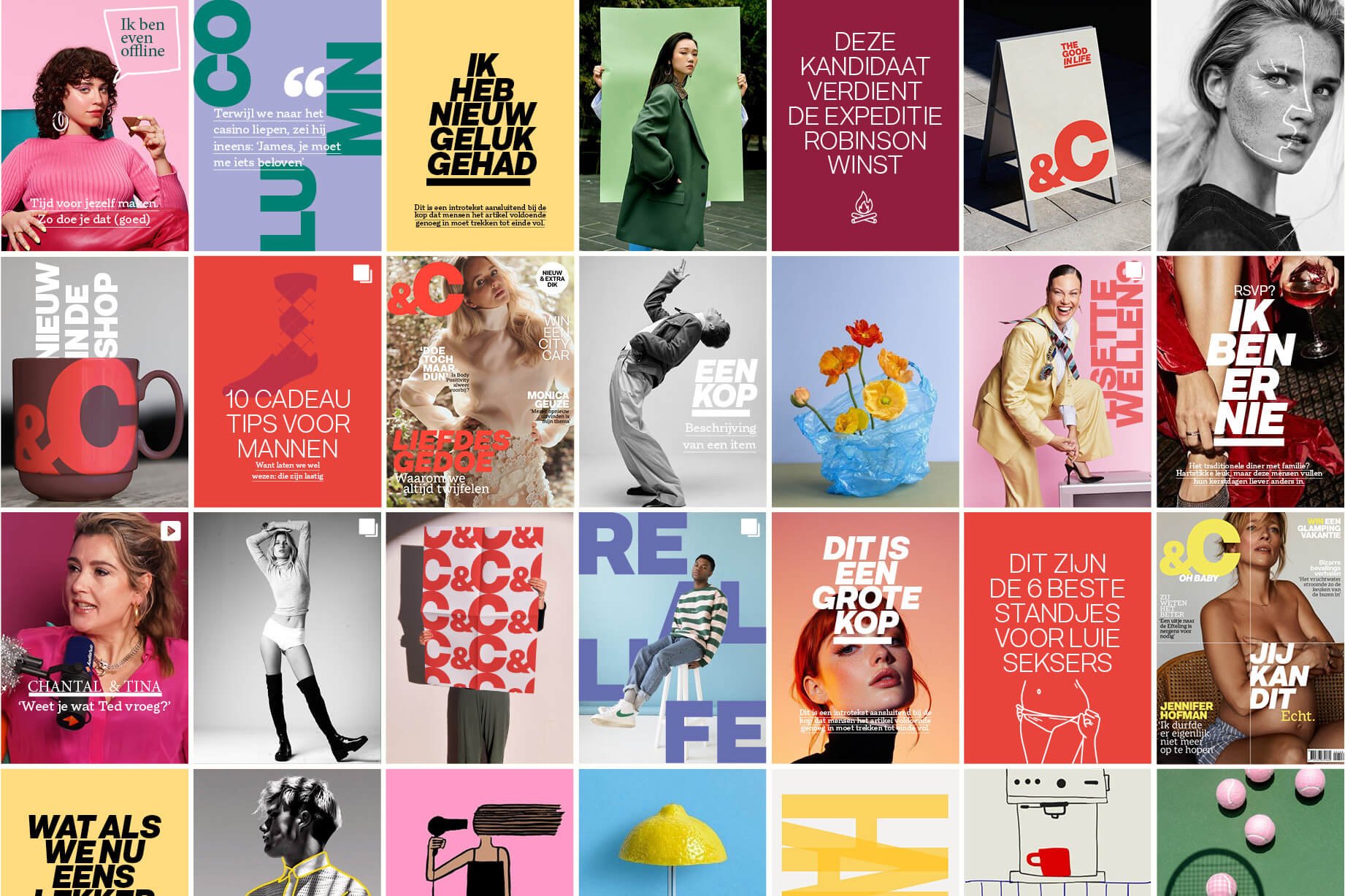
For the rebranding of &C Media, Studio Dorien Franken worked on a new visual identity that would prepare the brand for its next phase. Not a cosmetic update, but a fundamental repositioning of a media brand that operates across print, online, social media, podcasts, events, and branded content.
Together with the &C team, designer Dorien Franken developed a system that is both distinctive and flexible: strong at its core, yet with enough room to surprise across different channels. In this interview, she explains how a completely analog brainstorming session led to the concept Bold Statement, why simplification actually produces scalability, and how you design a brand identity that remains recognizable everywhere without becoming generic.
&C Media asked for a refreshed visual identity to match the next phase of the brand. How do you translate such a strategic repositioning into a concrete visual design process?
Dorien: “You always start at the origin of the question. What is driving that need? What should that new phase look like, and why now? A repositioning is significant, especially for a company like &C, which has so many facets: print, online, events, podcasts, a content agency, a product line. Slapping a new sticker on something doesn't work. An organisation doesn't just embrace that. You're dealing with culture, ingrained habits, operational processes. Everyone needs to be on board and everything needs to change. And for that you need trust, in the process, and in me.
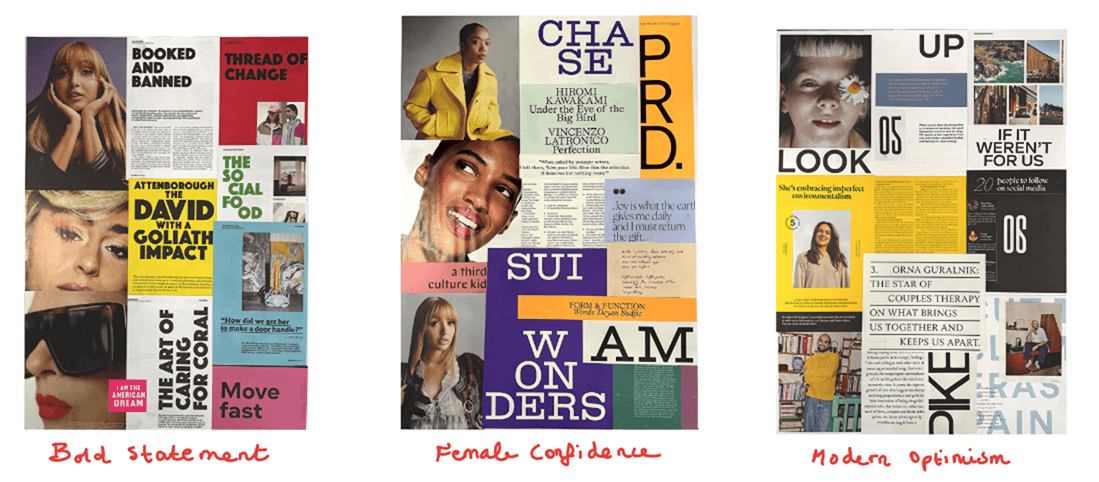
That's why I set up an analogue concept brainstorm as a kick-off. Fully analogue, deliberately. Because the moment you start sketching digitally, things quickly become too concrete, too finished. The &C team selected from their own print archive what they liked and what they didn't, and explained their choices. Meanwhile, I cut and pasted from more than fifty independent magazines to assemble three concept directions, which I presented on A0-format boards, each with a rationale, colour palette, typography set and visual direction. That initially produced a lot of opinions, then a good discussion, and ultimately better questions. Exactly what you want.
The concept Bold Statement was embraced by everyone, supplemented with influences from Female Confidence. After an extensive debrief, we had the official starting point. And we haven't deviated from it since.”
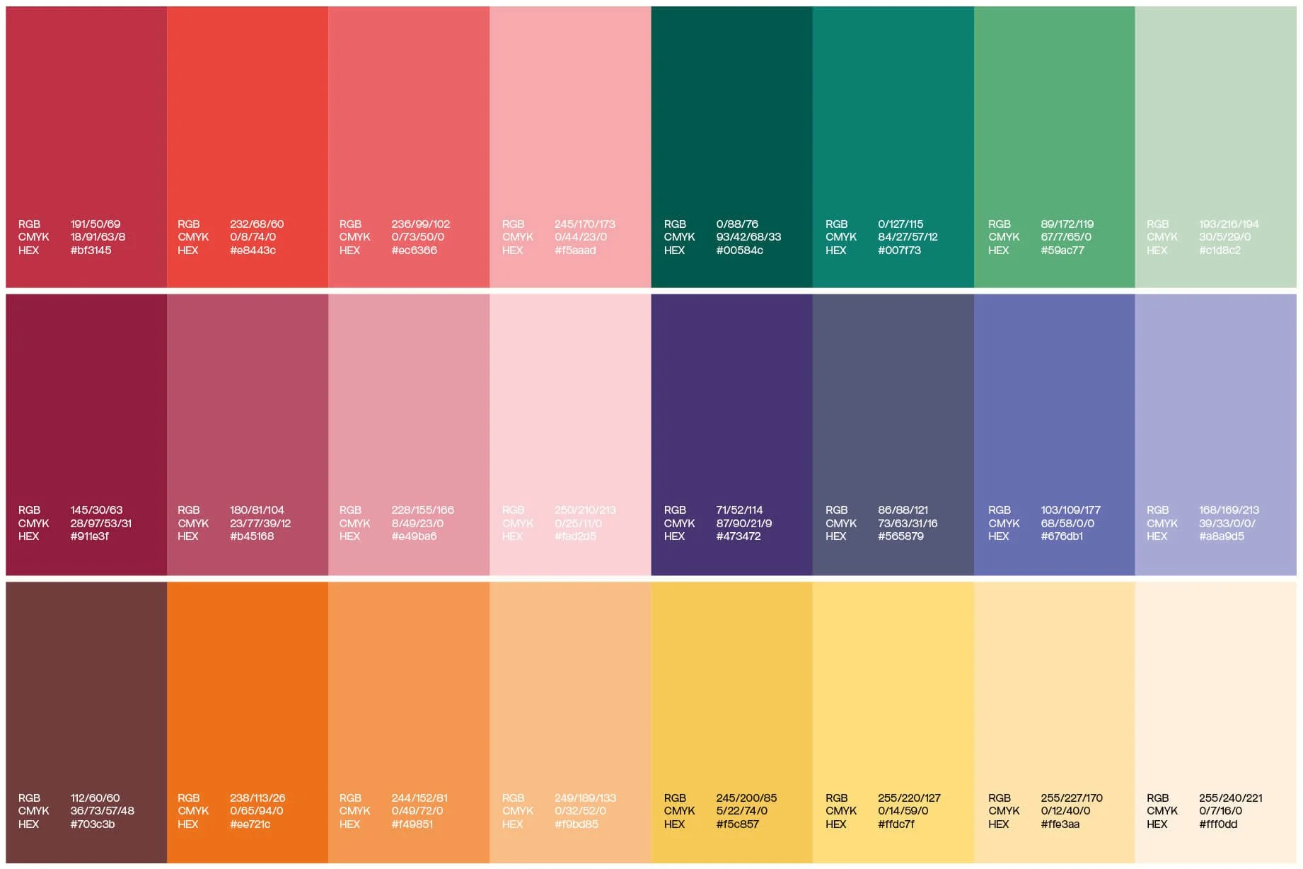
Bold Statement is a strengthened version of the current &C. It makes clear choices. Not a pencil line, but a marker stroke. Not pastels, but bold colour. Typographically, every page feels like a beautifully wrapped gift — a strong font for headings, an elegant counterpart for balance. A dynamic grid that offers variation. You keep turning pages. The photography style is open, light, considered. Bold Statement dares to surprise, has boldness, is funny and vulnerable. Curtains open. No secrets. No perfume.”
The identity needs to work across a wide range of touchpoints: from print and online to social media, podcasts, events and branded content. How do you design a system that holds up everywhere without becoming generic?
“The dry answer: by building a solid foundation with elements that are the same everywhere and never change, while also creating a fluid system that offers room to create and surprise per channel. I always think of bamboo: strong and stable at the trunk, supremely flexible at the top.
In practice, that means the static part, logo, colour, typefaces, styles and tone of voice, is consistent everywhere. The fluid part, where the brand experience lives, is shaped by imagery and design. A brand with a strong foundation should still be recognisable even without a defined image policy. Only then is it truly well-constructed.
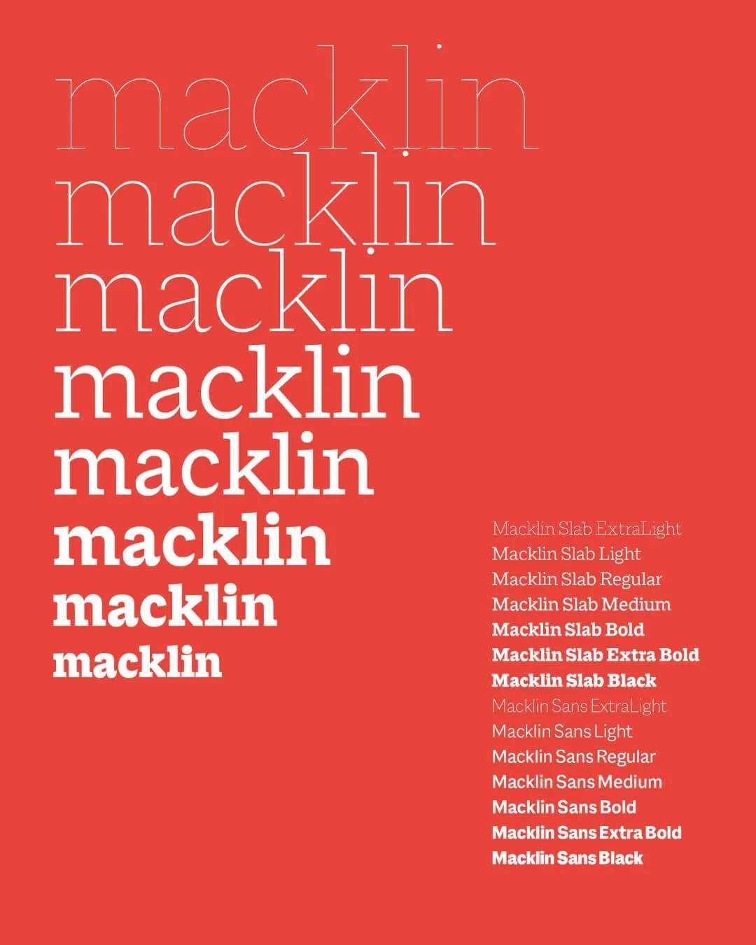
With &C, I used print as the guide. Print is the most demanding medium. It forgives nothing and breaks down without a well-considered system. Designing one beautiful interview spread is something almost anyone can do. But filling one hundred and seventy-two pages while keeping the brand voice crystal clear on every single one? That's a different story. Which elements ensure that? That question shaped the foundation of &C.
Additionally, each section received its own image policy, aligned with the new proposition: &C, (and see) the good in life. A proposition that promises &C stands for optimism, encouragement, self-deprecation, or as Chantal Janzen put it during the brainstorm: 'I want people to feel happy because of us.' Within that framework and with those guidelines, there is endless room to surprise across every channel.”
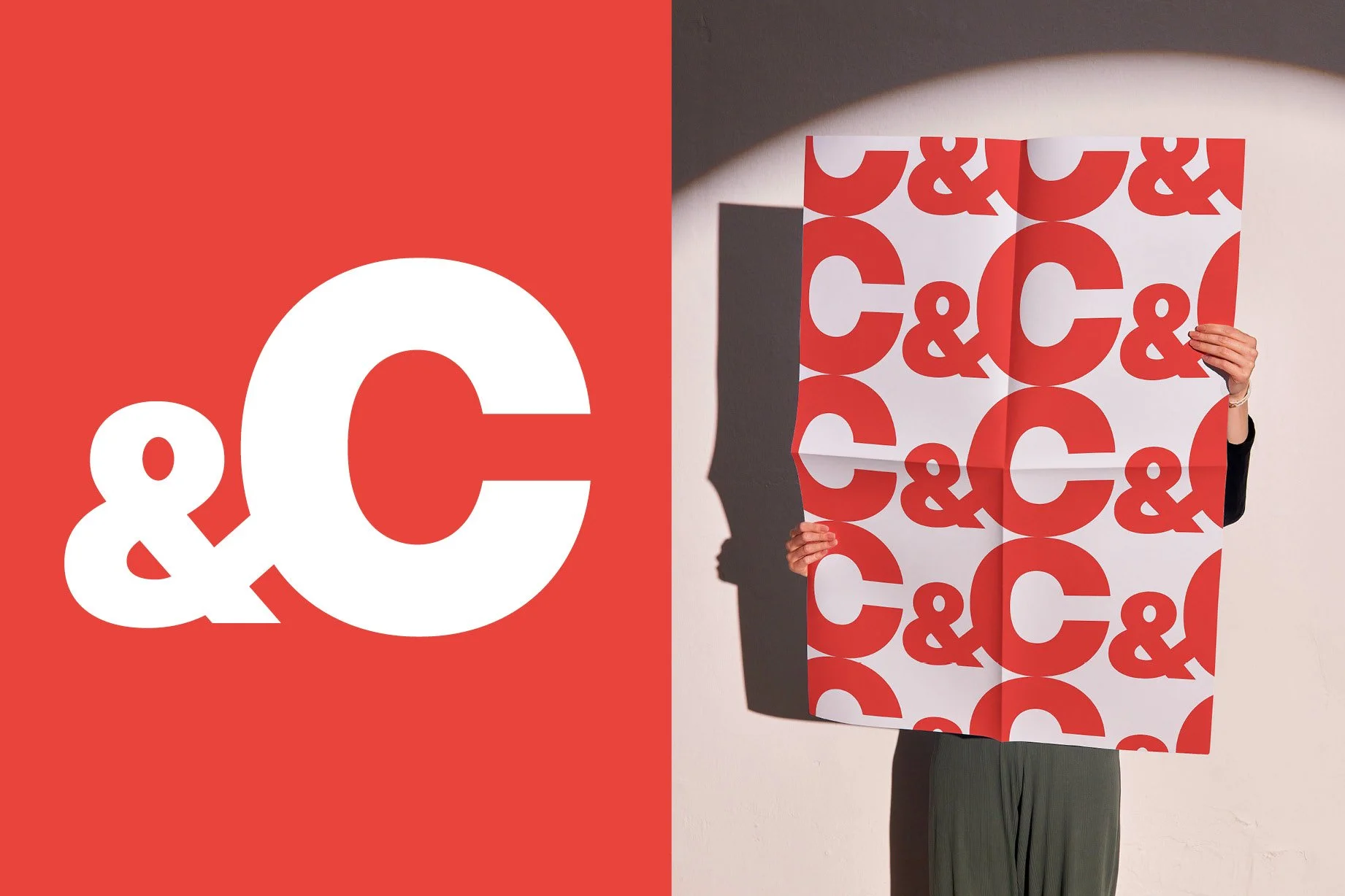
In the new identity, the ampersand and the 'C' play a central role as system-carrying elements. How do you determine which elements deserve that role?
“The real question is: what is the minimum you need to make clear that you are the sender, wherever the consumer encounters you? That is your starting point. Everything else is secondary. In projects like this, there's always a temptation to add things: another colour, another font, a trendy style. But it is precisely compactness that gives a brand room to keep growing without the recognition ever weakening.
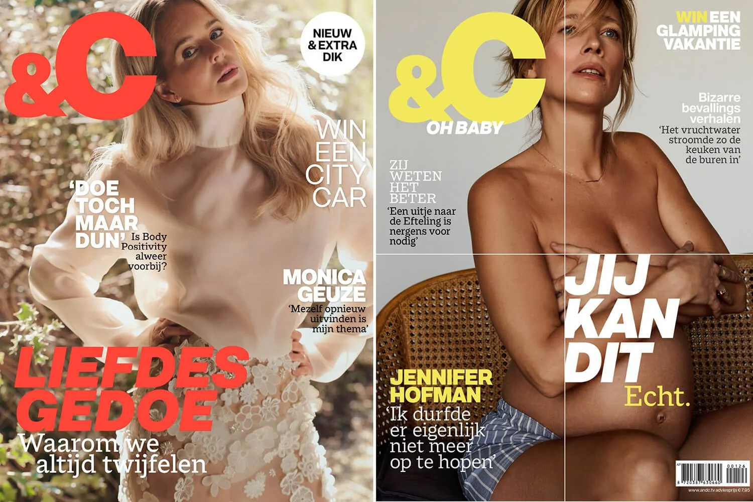
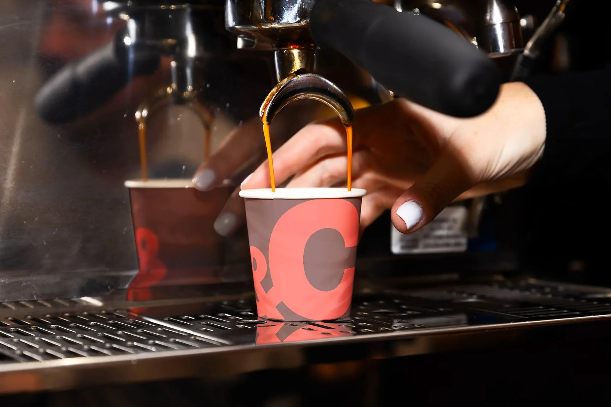
For &C, those elements are the logo, the colour red, and, not insignificantly, the face of Chantal Janzen, which is perhaps the most powerful system-carrying element of all.
The logo itself was an interesting challenge. Many people don't know it should be read as 'And see'. But putting the name up for debate was never an option. The strength lies precisely in the limitation of the form. The logo is actually not a logo but a brand mark, and a brand mark can be turned lightning-fast into a graphic element that independently creates recognition. Once that clicked, the possibilities became endless.”
The style moves between a mature positioning and a social- and mobile-first reality. How do you connect those two forces in your design decisions?
“For a media brand like &C that creates pure content, social- and mobile-first is logical and necessary. But at &C, print also runs through it, regular editions and specials. You want conversion: drawing online readers into an article and guiding them towards a print subscription, and vice versa. So I felt it was important to interweave those two channels more closely, also from a practical standpoint: content from print needed to be almost ready to publish directly online.
You can see this in the website, which is set up with an alternating one- and two-column grid where a lot of content is placed directly in the 4:5 Instagram format. By incorporating a translation to social templates into the print layout from the start, &C can reuse content cross-platform in a smart, fast and effective way.”
Which design decision, in your view, made the system truly powerful and scalable?
Photo: Dorien Franken | Photographer Manon van der Zwaal
Simplification. Deliberately choosing simplicity, and amplifying that. It meant every department could build towards the launch in a very focused way — because we made the switch all at once. Even the parking signs on the premises were updated. Bizarre, really. An enormous operation that an incredible number of people worked on. All credit for that goes to &C.
But that's actually just the beginning. No deliverable immediately after a launch is your best work. And that's fine. It's an organic process. You have to give yourself the space to discover teething problems, to notice that something works out differently in practice than expected. Only then do you keep growing.