

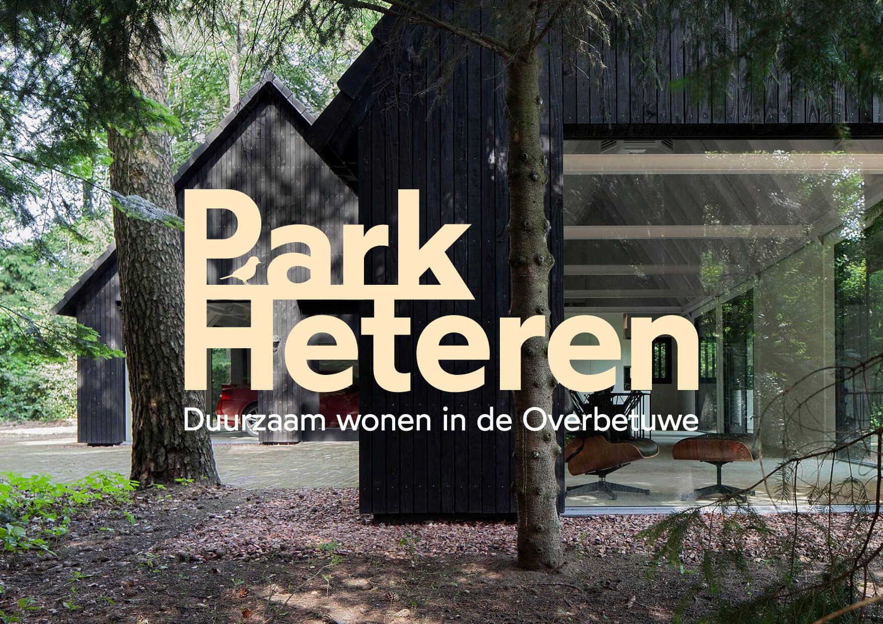
Green living in a lush area is the selling point for Park Heteren: a high-end sustainable real-estate project built with care for the environment. To bring the project to life, I created the brand strategy, positioning, and identity.
Services
Brand strategy
Brand identity
Naming
Website impression
Creative direction
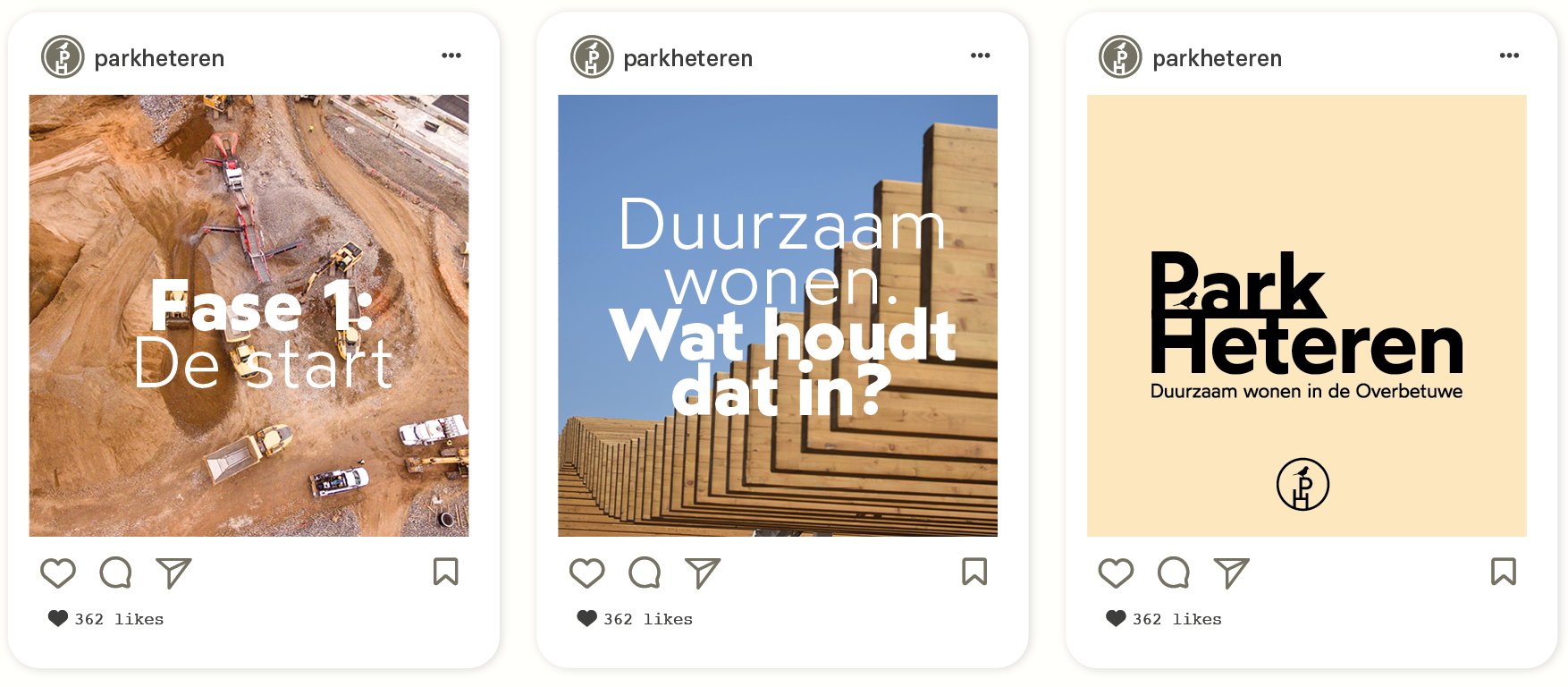
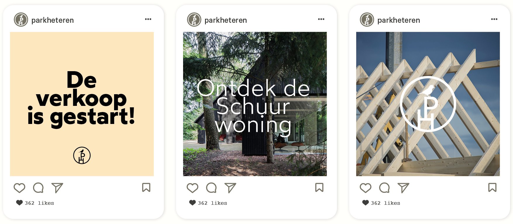
Social media strategy
Production
Brand guide
Identity design
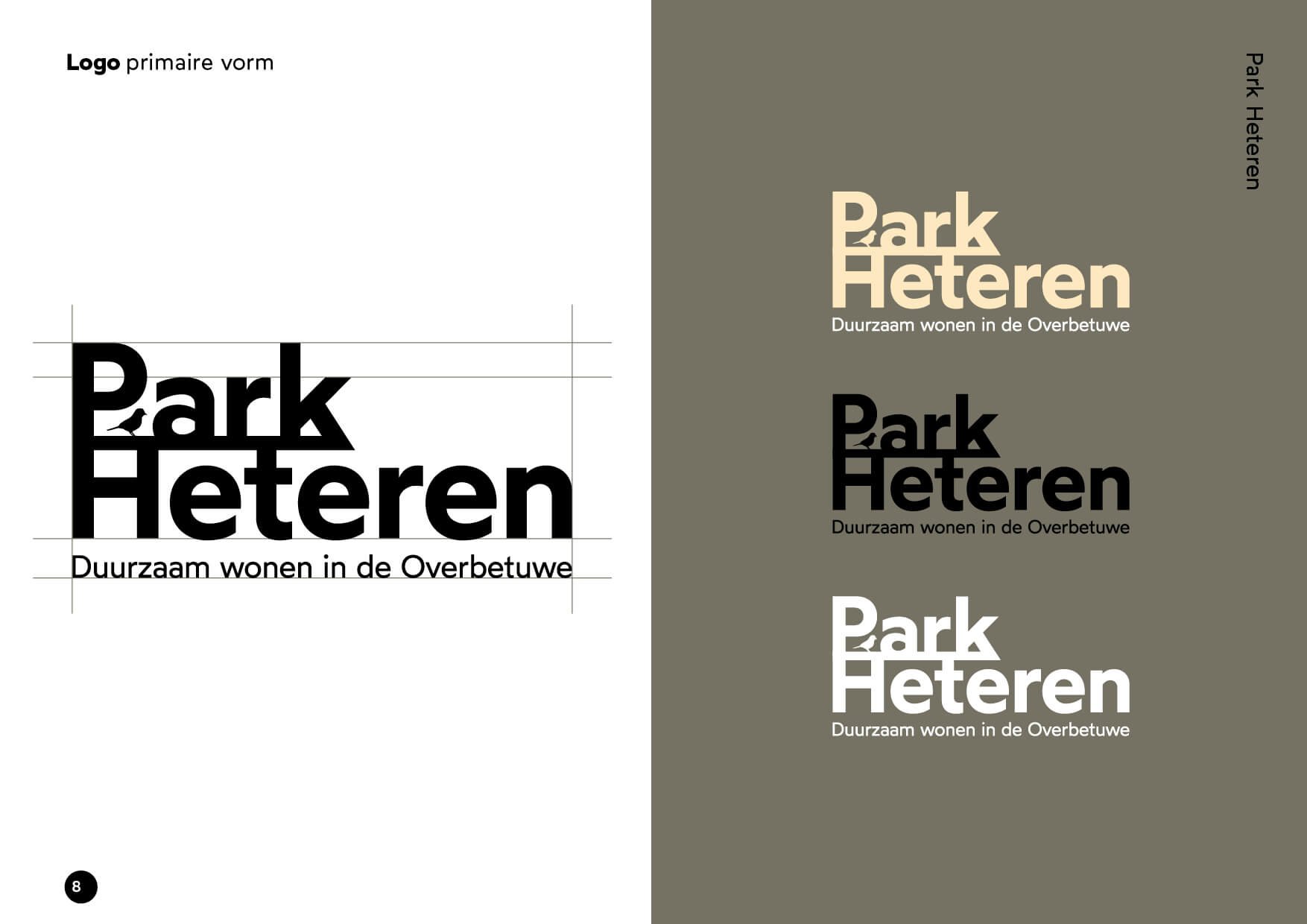
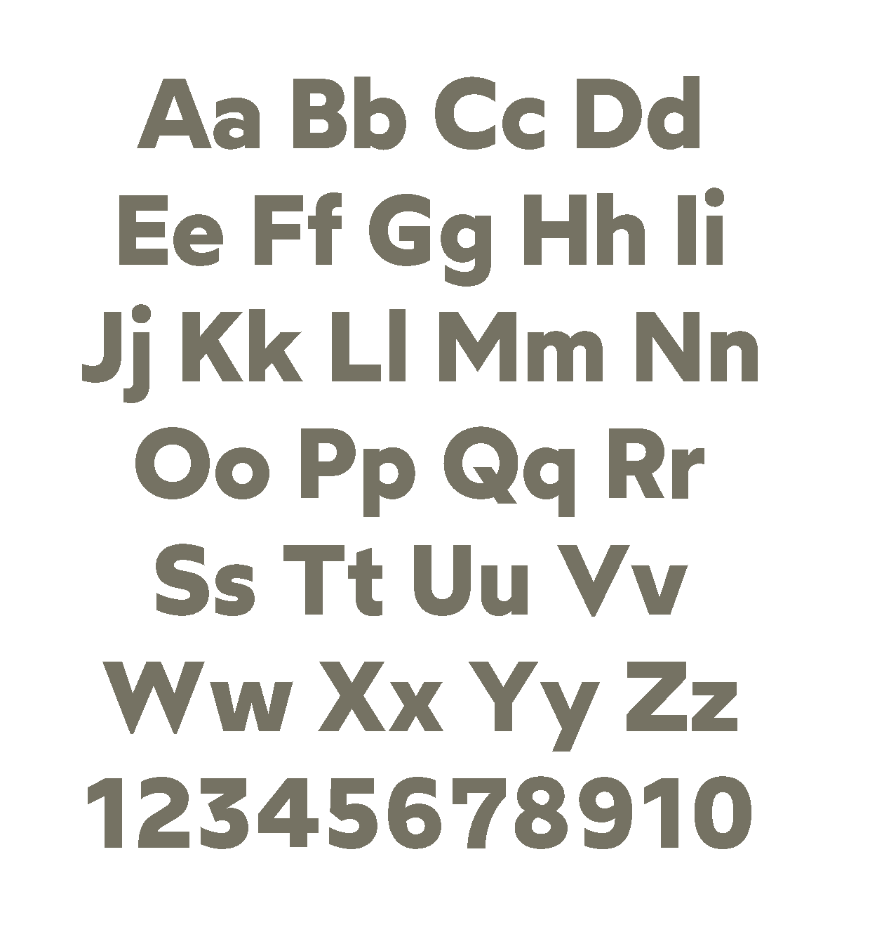
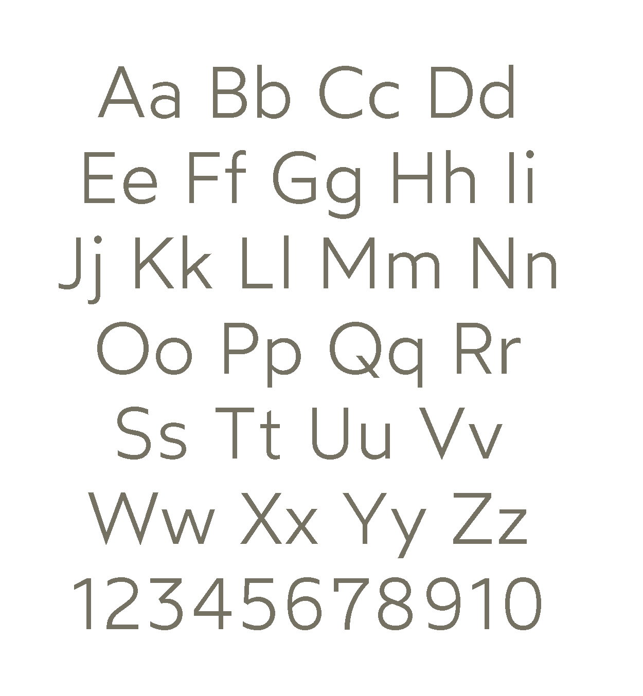
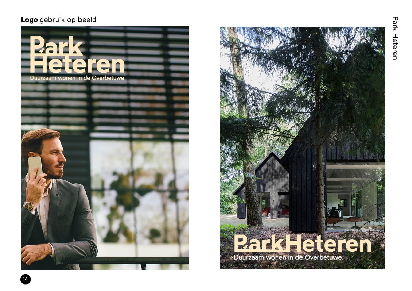
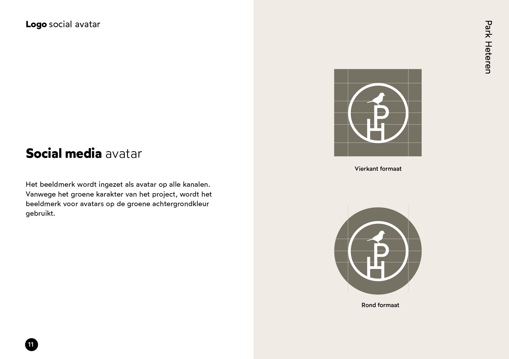
Inspired by the sustainable aspect of the project, I wanted to design an identity that spoke of nature. To achieve that I designed a bird icon to emphasize the ‘green’ energy of Park Heteren. The brand font is Wotford of the Atipo Foundry collection, a modern sans-serif with classical cues. It’s contemporary, refined, and functional but full of character.

A lush film about nature
In collaboration with filmmaker Daan Hocks, I created a film inspired by the selling point of the project: nature. Filming the lush area where the small sustainable project is built and adding complementary sounds in the background, the project's potential came to life.


Aside from social media templates, the project got automated e-mail templates to ensure potential buyers stay up to date.
More info
Collaboration
Website - Worck.nl
Film - Daan Hocks
Concept images - House of Architects